
Table of Contents: Final
- liaavidan
- Apr 8, 2023
- 3 min read
When editing my final magazine draft for my table of contents, I used the useful recommendations from my classmates, sparking my ideas to edit my table of contents further. The first draft of my table of contents also shaped my final table of contents, influencing my decision to change some fonts. I am, overall, more satisfied with all of the elements in my final table of contents.
First Table of Contents (top) vs. Final Table of Contents (bottom):

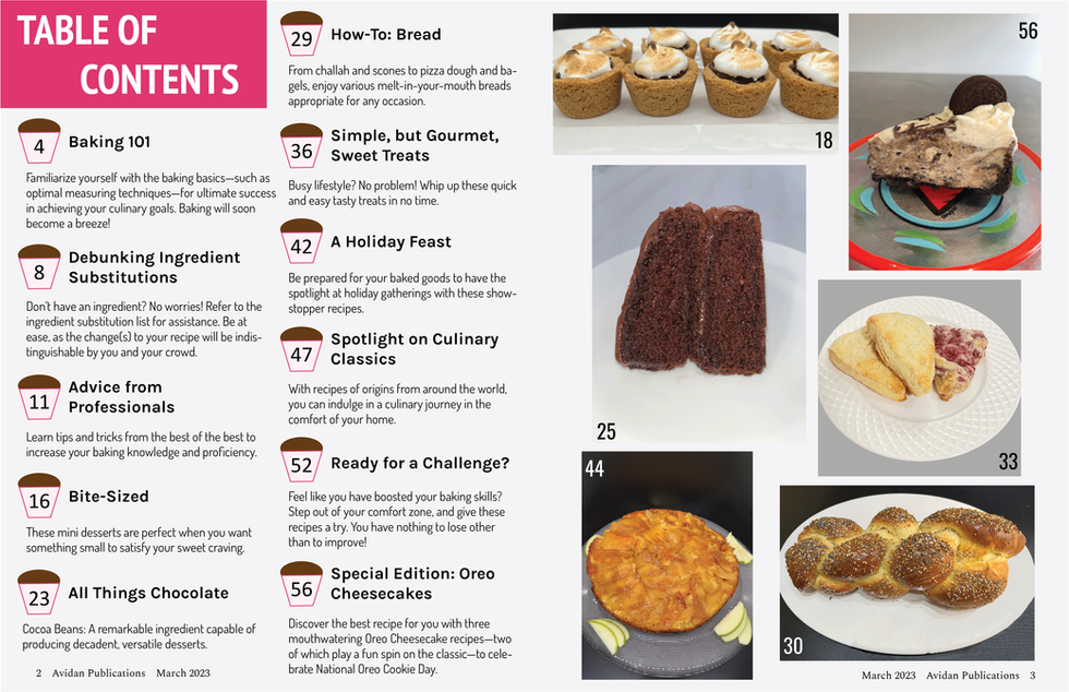


The differences between my first draft and my final table of contents were the typefaces, amount of white space in my gallery, and placement of my footer. I liked the font of the article headers and descriptions in my first draft to a greater extent, so I decided to use it in my final table of contents. This decision added more emphasis (the bold was stronger on the article headers) and evoked more relevant connotations (due to the formality and neatness of the serif fonts). I also changed the fonts inside the cupcakes to one more bold and compact, allowing the numbers to appear more and fit better. I also took into account the feedback I received that I should alter the position of the images in my gallery to have the same amount of space. I realized its benefits after executing this; it made my gallery neater and more organized since the spacing was consistent, and I could enlarge the images simultaneously (compacting my gallery allowed for more space on the page). I also made my footer closer to the edge of the page. I initially thought it wouldn't look as neat this way, considering I purposefully placed the footer where the content starts to vertically align them. However, moving it closer to the edge added more space between the footer and the content. Therefore, the page seemed less crowded—which is especially necessary on my table of contents since 11 articles are compact on one page. I am most pleased with the layout of my table of contents. In particular, I like how I separated the pages between my content and images, as it made the content easier to read and the images easier to see; it allowed me to make my photos larger (enhancing their details) and lay out my text in columns—rather than try and fit it below the images, like in my first table of contents draft. I am also satisfied with the cupcakes I made; they made the page numbers more visible and added depth to my table of contents—considering all of the pages (including my cover and article) have a light gray background, and the text is mostly one color. Another aspect of my table of contents that I am content with is the wording of the article headers and descriptions. They are convincing and appealing, primarily through emotion, enticing my audience to read the articles. My only concern for my table of contents is that the content is slightly crowded, and the font size is small. Yet, I didn't want to decrease the font size further to become illegible.
Although the differences between my first and final table of contents are slight, they enhanced my final table of contents to a full extent; I don't think that the typography and layout of my first are superior in any way. I am pleased with the wording and format of my table of contents, yet I think I would've been more successful had I sketched ideas for my table of contents as I did with my magazine cover sketch. It would allow me to plan my ideas before creating the layout in InDesign and possibly prompt my thoughts further. In other words, I can sketch graphics using creativity rather than digitally on InDesign (a platform I was initially unfamiliar with).


Comments