
Table of Contents: First Draft
- liaavidan
- Apr 4, 2023
- 8 min read
The next milestone I reached for my magazine, upon designing two drafts for the cover, was creating two drafts for the table of contents. These drafts helped me familiarize myself with the layout and softwares I will use in my final magazine and organize my thoughts into a physical layout before class revisions. Like my cover drafts, I used Adobe InDesign to create the drafts for my table of contents, keeping in mind conventions my product uses and challenges in the Cooking, Food, and Beverage genre.
Planning:


Outlining my ideas before executing them on InDesign was a success. As Google Slides is simpler to use, it was easier to structure my ideas and format my content how I intended. Google Slides also prompted my thoughts since they have more premade shape options than InDesign, which I experimented with to add more dimensions, visuals, and emphasis to my magazine. For example, I used the premade Google Slides shape, a half frame, to add to two opposite corners of the images in my magazine. Without planning on Google Slides, I wouldn’t have seen this visual element (the only tools available for creating shapes on InDesign are the rectangle, ellipse, and polygon tools), and my magazine wouldn’t be as eye-catching. After viewing the features on Google Slides and contemplating how to make my magazine unique, I realized I could vertically flip a trapezoid below half of an oval to form a cupcake. The cupcakes would creatively replace bullet points and add color.
Transferring Drafts to InDesign
Draft 1:


Before formatting my first table of contents draft, I edited and refined my images in Photoshop to increase their neatness and professionalism. As shown in the first image, I captured the shot of the challah with my phone shadow appearing in the background. To minimize the shadows, I drew light gray over them with the Brush tool, using the Eyedropper tool to find the exact shade (image 2). It was initially challenging to blend in the colors since each portion of the plate had a color variation; even the slightest color differences made my refinements noticeable. Lowering the opacity of my brush when needed and drawing over the non-shadowy parts of the plate (creating one consistent color of the plate) helped the edits look less visible. I also edited the shot of the Two-Bite S’mores by using the Spot Healing Brush tool (a tool that removes blemishes from a photo) to remove the small, scattered crumbs across the plate, making the shot look spotless and tidy (image 3). I also edited the image of a slice of chocolate cake, yet I did it after creating my table of contents. Although it wasn’t in my table of contents while documenting how I made it, I added it in afterwords to show in the final product.
Once I finished editing my photos, I began to design the layout of my table of contents in InDesign. I started by writing “Table of Contents” in PT Sans Narrow Bold, fully capitalized, and with a large font size for easy navigation through my magazine. I then added my first image to the page, the Two-Bite S’mores. When planning on Google Slides, I noticed that one of the premade shapes they provided was a “Half Frame.” I added pink half-frames to two opposite corners of the photos to make them stand out. This shape isn't in InDesign, so I manually made it using the Rectangle and Pen tool (image 4). In the fifth image, I filled this right triangle with the hot pink color used throughout my magazine, made the border transparent, and moved it to the bottom left corner of the Two-Bite S’mores image. I also arranged the right triangle behind it, making the full image visible. I applied this process to the second image on the page (the slice of chocolate cake) and then made cupcake icons. These icons are composed of two shapes, using a trapezoid which I vertically flipped and stretched horizontally (image 6), and an ellipse that overlapped the trapezoid (image 7). The following image shows how the cupcakes look after adding color and placing them where I want my articles to be. I chose light pink as the color of the cupcake wrapping as it is one of the colors in my color palette, complements the colors on the page, and implies sweetness; I chose brown for the top of the cupcake since it is a leading color of the images on the page and is a popular cupcake flavor. I next added text, but before doing so, I downloaded the fonts from my plan that InDesign didn’t have (such as Hind Siliguri, which I used as the font for the headers of my articles). I used the Spectral font for the font of my article descriptions, which I also needed to download (image 10). My table of contents has 11 articles and couldn't fit on one page, so I split it into two. Images 11 and 12 show the completed look of the first page of my table of contents—with page numbers in the cupcake wrapper that indicate the start of the article and all of the article descriptions—and me preparing the second page of my table of contents; I added two images to the second page (the left is of challah and the right is of an apple upside down cake) and more of my cupcake icons, which I arranged vertically, as I found the articles were easier to read and looked more pleasing to the eye. In the two images after, I edited the page numbers and added a light gray background (a consistent background color throughout my magazine). As mentioned above, I edited the photo of the chocolate cake and replaced it after finishing making my table of contents. Consequently, only the last screenshot of me making my table of contents shows the edited version of the chocolate cake.
Draft 2:


Like my first draft above, I wanted to perfect the images I added in my second table of contents draft; I added two additional photos to my second draft, which were of a slice of Oreo cheesecake and plain and raspberry scones. I edited both through Photoshop, in which I removed imperfections, along with removing the background of the second image. Regarding the Oreo cheesecake, I edited the crumbs on the plate, the messy tip of the cheesecake, and the smudged cream. I removed these flaws in the photo via the Spot Healing Brush tool, allowing me to choose the areas I wanted to remove blemishes, which it would then quickly eliminate. The first screenshot of making my second table of contents draft shows the messy tip of the cheesecake before I used the Spot Healing Brush tool. With the scones, I removed minor blemishes from the dessert and plate (circled in red) using the same Photoshop tool. I then removed its background using the Quick Selection tool and refined my selection in the Select and Mask Workspace (I wasn’t pleased with the placemat). Once I made the background transparent, I used the Paint Bucket tool to add a gray background, a realistic background color that complements the colors of the scones and other images.
To create my second table of contents draft, I first duplicated the pages of my other draft, making it easier to adjust the layout and fonts while keeping its main features consistent—such as font size, images, and descriptions (image six). Whereas I centered the title in my first table of contents draft in the middle of the page, directly above the background, I wanted to see if it would look better above a pink rectangle positioned at the top left corner of the page (which could make it stand out positively or negatively). I then edited the header and description of each article from the Hind Siliguri and Spectral fonts to the Karla and Dosis font, respectively (images eight and nine). The tenth image is of me moving the article headers and descriptions that were on the right page of my first table of contents draft to the left page of my second table of contents draft; unlike my other draft, I wanted to try to combine all of the articles onto one page, leaving the other page solely for images. I then added the same light gray background from my magazine’s cover page and first table of contents draft to develop uniformity; image 11 shows me adding it before arranging it to the back of the page. Lastly, I re-added the chocolate cake shot after I edited it in Photoshop.
Final Product of Table of Contents Drafts
First Draft (top) and Second Draft (bottom):


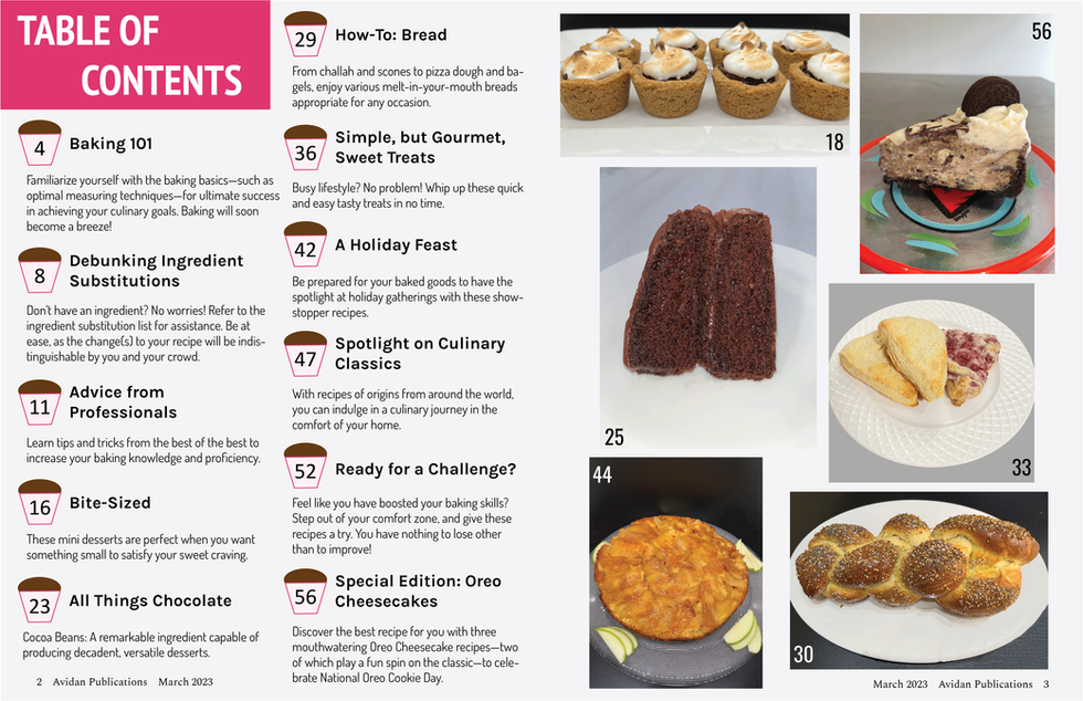
Although I am pleased with both of my table of contents drafts, I like the second one the best. The title has more emphasis with the rectangle behind it, and there are two more images (a slice of Oreo cheesecake and a plate of plain and raspberry scones), displaying more of the food my magazine features. The pages are also more defined and look less crowded in my second table of contents draft since one page only has text and the other only has photos. On the other hand, my first table of contents draft may be confusing since some of the images above the columns don’t necessarily correlate to the articles below; there is a picture of Two-Bite S’mores above the first column, yet that recipe is on page 18 and would fit under the second column. It is worth noting that I like the fonts more in my first draft and will change my second draft to these fonts. In particular, the fonts are more pleasing to the eye and are easier to read (there is a smaller kerning, and therefore, the letters are more compact). They also connote formality, sophistication, and elegance, which is most fitting for my magazine.
Using and Challenging Conventions:
The final product of my magazine’s table of contents draft uses conventions in the Cooking, Food, and Beverage genre as there are images throughout, with varying sizes and dimensions. I created a table of contents with photos since I wanted it to display the baked goods my articles will feature, attracting people’s attention and enticing them to keep reading. The page numbers are beside the headers of my articles, and they are bolded, while the descriptions aren’t. Considering this format, readers can easily understand how to navigate the magazine. It also adds emphasis and makes the headers stand out from the descriptions; if a reader is skimming the table of contents and doesn’t want to read the specifics of the article, the bolded header will summarize the points and attract their attention. My magazine’s table of contents also uses columns to structure the pages, making the articles organized and neatly arranged. Nevertheless, my table of contents challenges conventions since it creatively showcases the page numbers of the articles and images; my magazine has page numbers inside of cupcakes, unlike most magazines which don’t usually have page numbers inside icons—and instead, usually directly above a background.
As I continue to design my magazine, I am constantly learning more about Photoshop and InDesign. For example, I have recently learned about the Spot Healing Brush tool in Photoshop, an effective method for editing imperfections in images. I have also figured out how to create stars and triangles in InDesign. Designing a magazine needs careful consideration of each element, such as the color scheme and where to place the content and visuals. Therefore, this process has helped me understand which colors complement each other and the best placement of magazine elements that could attract my audience’s attention and look most appealing. While analyzing my two drafts to see which I like best and other magazines' table of contents to examine the conventions, I have begun to look at things in closer detail and reflect more on my work.


Comments